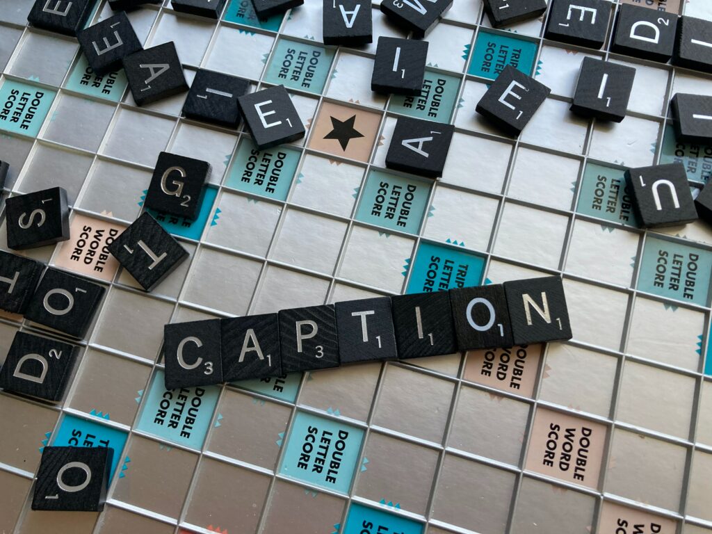
What constitutes digital accessibility?
Prior to this week’s EdTech class, I thought of digital accessibility as something garnered through supporting applications or devices (like screen readers). It was compelling (and slightly overwhelming) to learn about all the ways I can modify my blog from the backend to make it more accessible to others.

Some of these tasks were enjoyable to me. For example, I greatly enjoyed going through my previous blog entries (and this one) and inserting alt-text for the images in my posts so that folks using screen-readers will be able to engage with the content of these images, too. I didn’t know about alt-text beforehand, and considering how much fun I have picking out images for my blog, I’m glad to be able to share them with all my readers.
I was also surprised to learn about how properly formatted headers allow those with screen readers to more easily navigate through cohesive chunks of written work, as opposed to having to wade through a wall of text for a specific point. Additionally, I was interested to learn more about high-contrast elements and the ability to zoom into text across browser and mobile mode to make reading accessible for visually impaired readers.
What practices often get missed?
As soon as I learned about the importance of high-contrast elements for visually impaired site users, I instantly thought about the many ~aesthetic~ websites I’ve scrolled across (blogs, or even shop sites) that prioritize cute color schemes over accessibility. I think this also beckons a larger conversation about the lack of awareness around digital accessibility; what it means, how it functions, and how to get started.
Check out this great video we watched in class this week:
I wanted to share the above as it provides more specific examples of digital accessibility, and grounds these examples in the importance of their real-world contexts.
I also wanted to share this great website to check how accessible your blog (or a favorite website) is. I appreciate that it flags specific errors or concerns, and provides context for why these accessibility considerations matter.
An Accessible Return to a Past Multimedia Strategy

Last week, my reflection post featured a screencast video (utilizing H5P) that showcased how to search for just the right pattern on my favorite website, Ravelry. While I was very excited to create this video last week, I am now acutely aware of the fact that I created a video without captions. I have rectified the previous tutorial by uploading it to YouTube, and manually editing the auto-generated subtitles.
This process took considerably longer than I thought it would, and that is with auto-generated subtitles on a relatively short video. I believe this extra time was absolutely worth it, though it gives me much greater respect for longer-form video essays I have watched on YouTube (30+ mins) that use well-formatted subtitles.
What has your experience been with creating digitally accessible content? Was there anything you were surprised to learn about in this post? Drop me a comment below to check in.

featherfarrerart99
Woah Heather, this was like reading a professional blog, your tone is perfect. You covered everything we did in class in a super concise and clear way and formatted the post to easily convey it all. I’m honestly struggling to find anything to “critically critique” I think was A+.